Would you leave the walled garden? Internet.org UX in images
Internet.org justifies itself as a development project, for people like “poor fishermen” who are new to the internet or can’t afford it. But according to some accounts, that’s just not the profile of who’s using the service. In India, as many as 80% of internet.org users are already familiar with the broader mobile internet, but are using it because it’s free (wouldn’t you?). Perhaps that’s because it’s marketed as “free internet.”
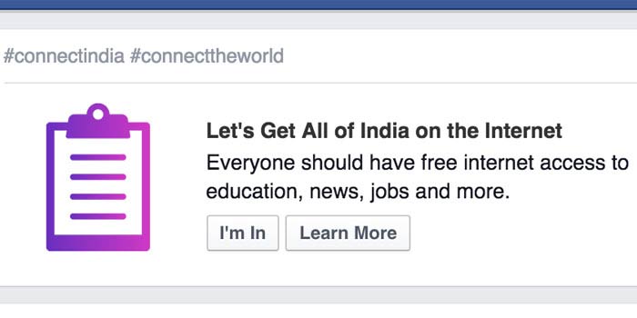
Though internet.org is neither the internet nor a dot org, you might find a Facebook-led petition appealing “Let’s Get All of India on the Internet!”
The Indian Department of Telecommunications just released its Net Neutrality committee report—one of the recommendations is that “content and application providers cannot be permitted to act as gatekeepers” and that zero-rating of applications should be approved on a per-case basis. I wonder how internet.org fares as a case? How could it not be creating unscalable barriers for those app developers who don’t want to play by Facebook’s rules, and who aren’t able to negotiate zero-rating arrangements of their own?
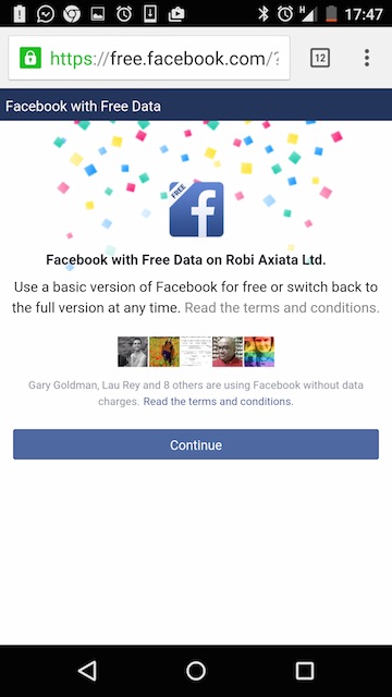
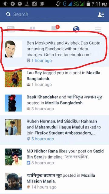
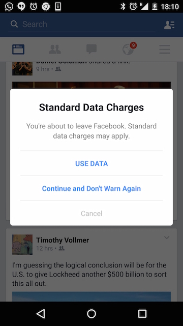
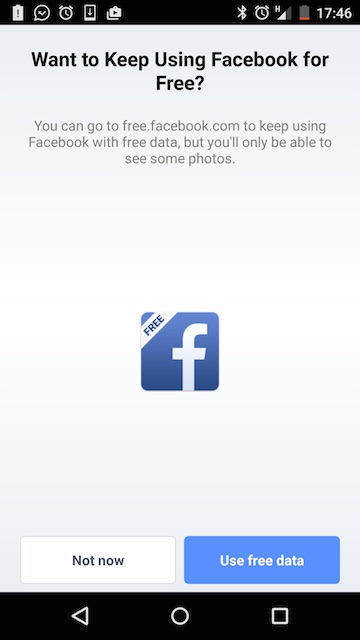
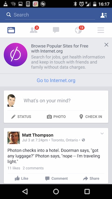
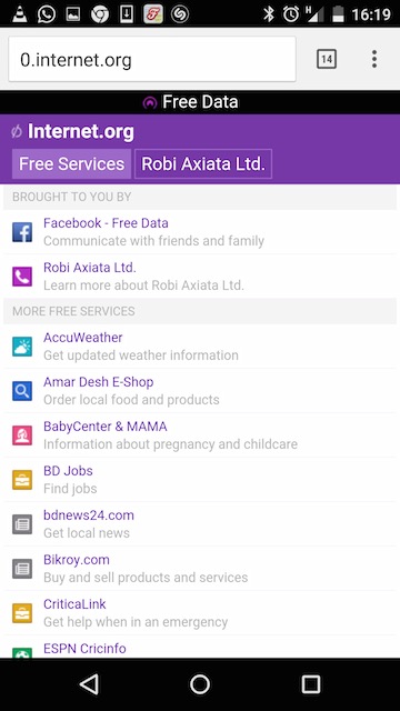
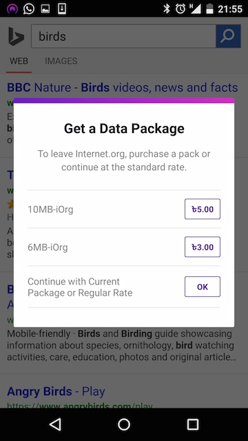
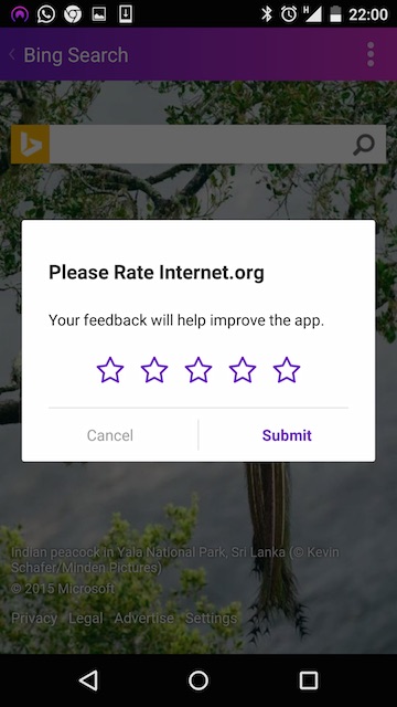
I just returned from Bangladesh, where I bought a Robi SIM card and used the internet as I’d normally do. I was a paying customer, with a healthy 2GB pre-paid allowance. Yet I was hard-sold “free” — really hard. As a Facebook user, free was pushed onto me constantly. Have a look at some screenshots from my trip and let me know what you think.
About this entry
You’re currently reading “Would you leave the walled garden? Internet.org UX in images,” an entry on Ben's blog.
- Published:
- 7.17.15 / 1pm
- Category:
- Design, Digital Divide, Mozilla, Net neutrality, Strategy, Zero rating
- Tags:


Comments are closed
Comments are currently closed on this entry.